Community Pharmacy England
The Brief
We worked with Community Pharmacy England to design their 30 page annual report document, as well as to help amplify the reach of the key messages of the report with an engaging animation.
The Approach
Work began with the graphic design for the report document. We developed a style for this year’s report that gives a fresh look, whilst maintaining adherence to the strong CPE brand style.
We chose a different brand colour for each section of the report, keeping the design bright and eye-catching. We used a combination of gradient backgrounds and full colour backgrounds, with iconography and text boxes that are both solid and simple outlines.
Work began on the animation at the mid-point in the report design process. We took the style that we’d created for the report and carried it through to the animation, ensuring that the assets sit together as a suite. We used the same combination of gradient and solid backgrounds, and employed our box outlines to house key text and iconography.
The voice over for the animation is delivered by a warm, professional female voice, with a delivery that has the right balance of seriousness and positivity fitting the key messaging and tone of the project.
To view the full Annual Report, click here.
More Like This...

Birmingham Women’s and Children’s NHS Trust – Oral Health for Children with Congenital Heart Disease
Read more...
Pharmacy funding settlement explainer
Read more...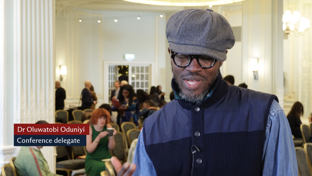
MDU international medical graduates video
Read more...
SRUK patient information animation series
Read more...